Explore my various case studies where you can see the details of my projects!


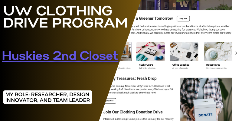
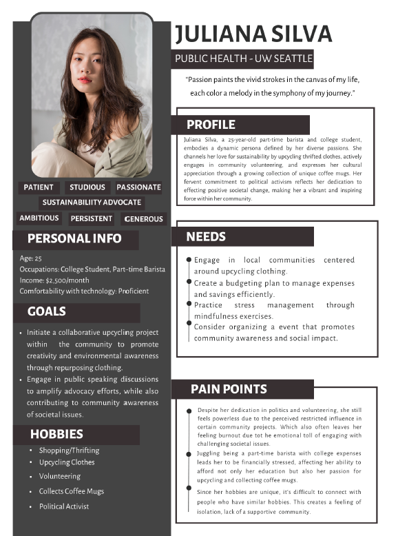
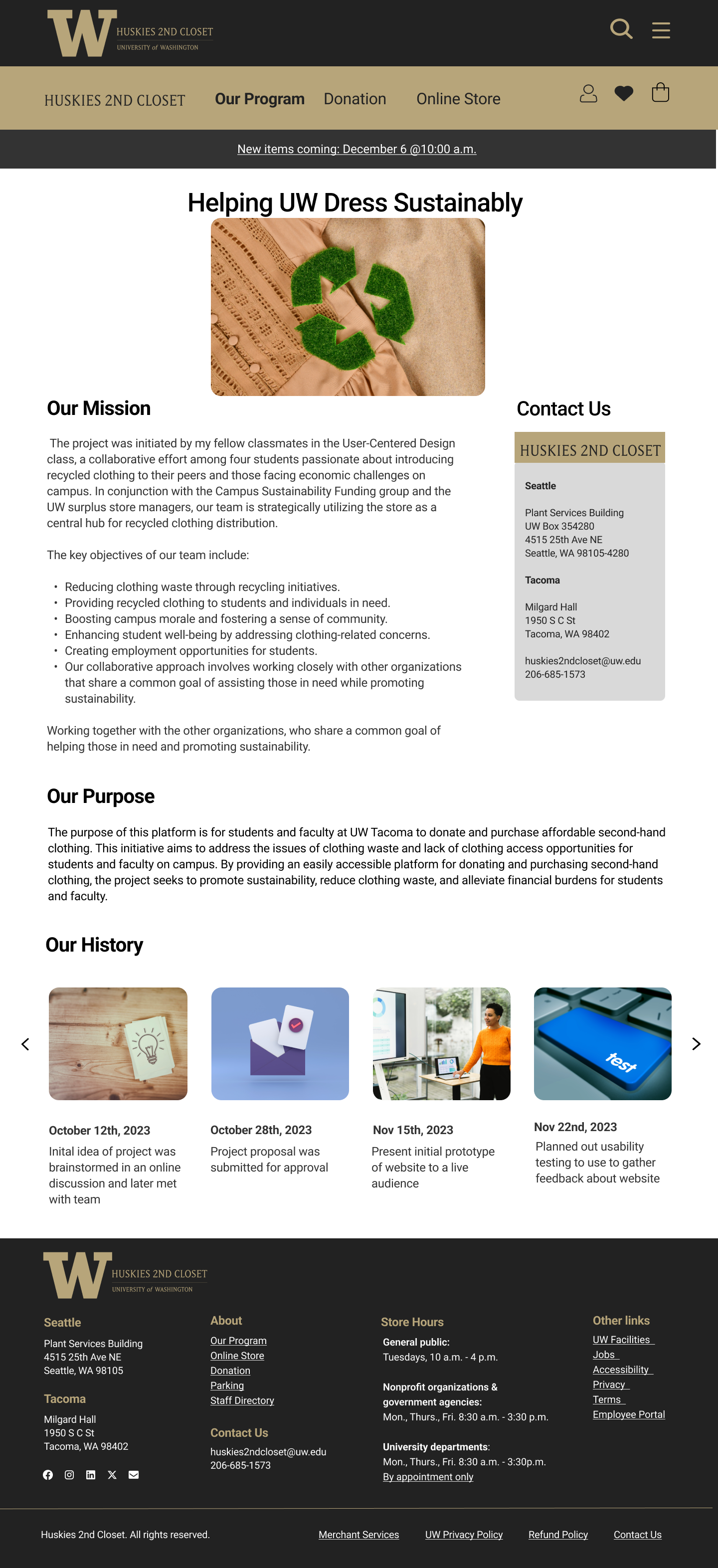
Huskies 2nd Closet was a student-led initiative to address textile waste and support students in need by facilitating a clothing drive on campus. I led a team of four, including Tien Cao, a seasoned designer, and two others experienced in social economics, to create a website where students could donate and purchase recycled clothing at affordable prices. Inspired by the intersection of clothing accessibility and student mental health, our project not only aimed to reduce waste but also to enhance student well-being.
Created by Guinevere Mangrobang
Students are spending close to 12.5 billion dollars on college clothing in 2023 (Smith, 2023), with 18 million tons of textile waste in the same year (Royal Waste, 2024). With the climbing prices of clothing, many students, and even faculty members, on campus are struggling to afford clothing, leading to a decline in well-being. We wanted to look into the recurring issue of students struggling to afford clothing, which could lead to a decline in mental fortitude. To do this, we created “Huskies 2nd Chance”, a program prototype that would help address some of the clothing issues on the University of Washington campuses. We also tackled the issue of high amounts of textile waste on campus by improving and expanding the clothing donation program that is currently being used on the Tacoma Campus.
In our initial user research we utilized various methods such as interviews, observations, surveys, and first-click testing to better understand our target demographic—college students interested in recycled clothing. Our findings revealed that 84.4% of students are struggling due to rising living expenses, with many exploring thrift stores like Goodwill. Sustainability emerged as a significant factor during our interviews with students, although it varied in importance relative to price and convenience. Concerns were also raised about the quality and availability of donated clothing. Observations highlighted the need for our platform to offer a cheaper selection of clothing compared to thrift stores like Goodwill. Our other methods also showed that users wanted a user-friendly search interface, clear descriptions and images, and a peer-to-peer donation system to better serve students and the community.
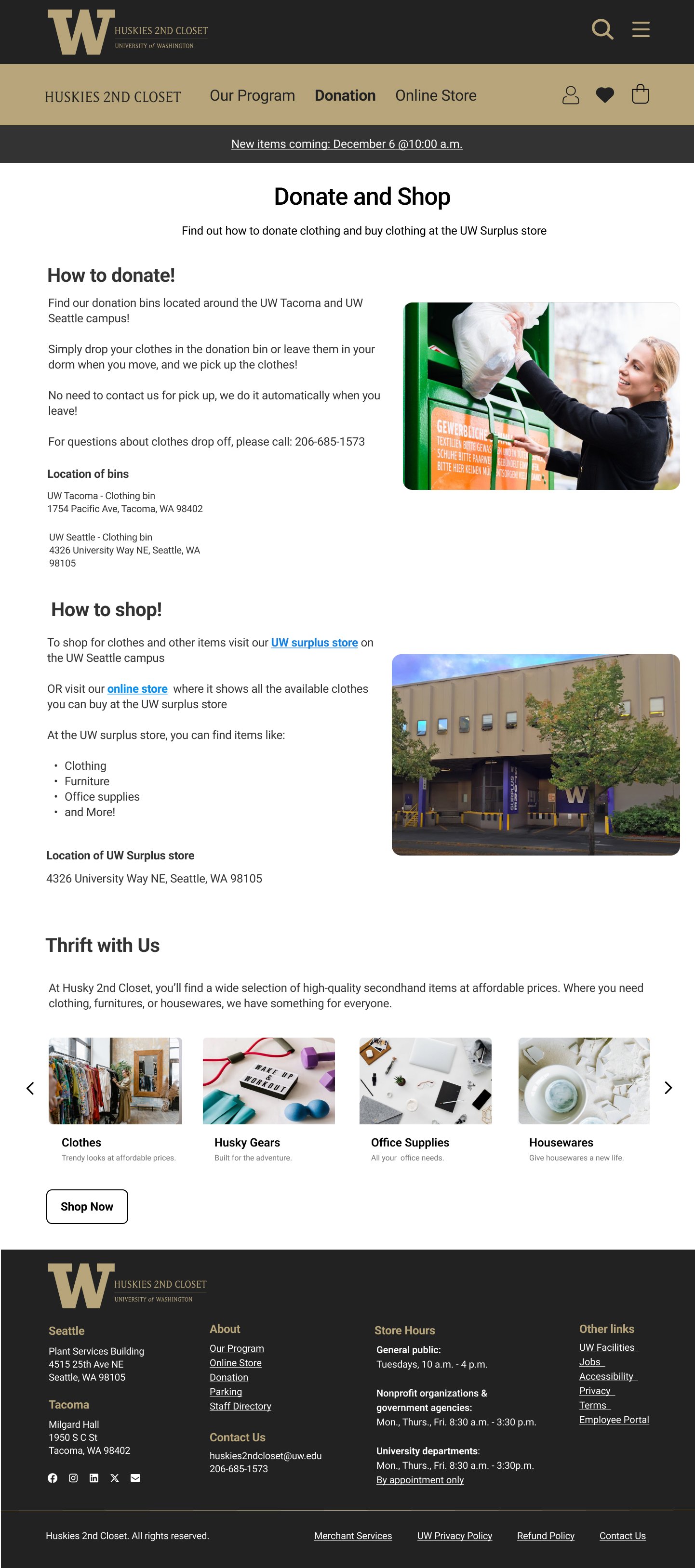
From our user research we started with a simple mock-up design that gave us an idea of what features we wanted to include, information, and general layout of our pages. We decided on an online store function that gave students a chance to see what goods were available. We also wanted a page dedicated to giving information to students if they had questions, as well as incorporate a donation feature to stop waste and be the core of our recycling goal.
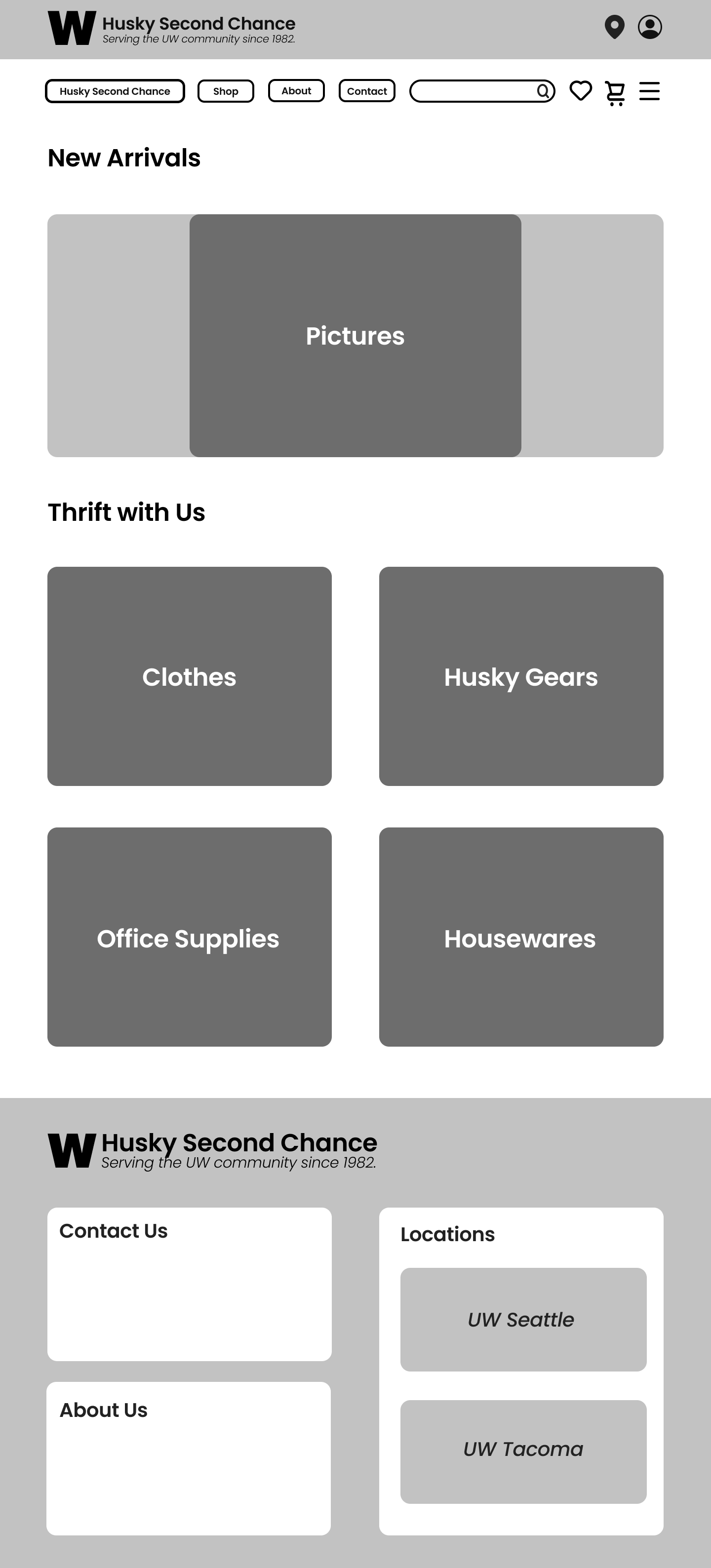
First Iteration of Online store by Tien Cao
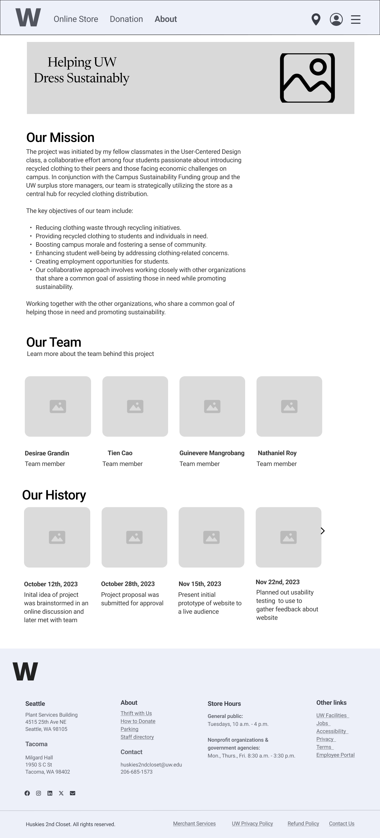
Second Iteration of About Page by Nathaniel Roy
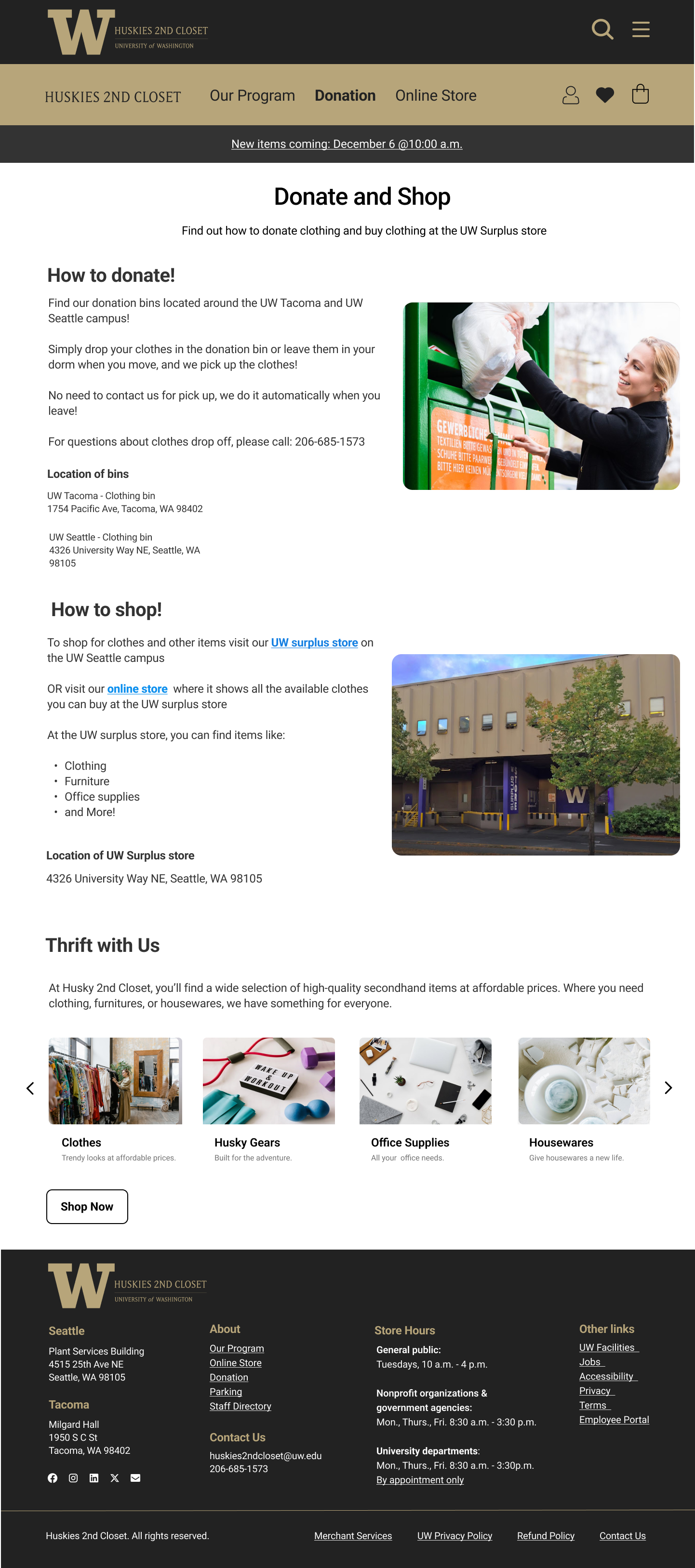
Final Iteration of Donation Page by Desirae Grandin (myself)
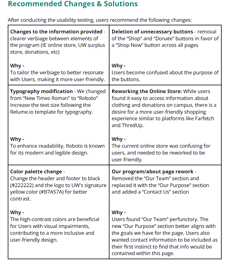
Our usability research consisted of surveys and 1-on-1 usability testing employing the Concurrent Think Aloud moderating technique. The usability testing was done on 2 users that matched similar demographics of a young college student struggling financially. We used this data to create a user-friendly online store where students can view available items, an informational page, and a descriptive donations page. These webpages not only complement the current UW Surplus Store but also expand on its features, improving access and efficiency in recycled clothing programs.

First Iteration of Online store by Tien Cao
Second Iteration of About Page by Nathaniel Roy
Final Iteration of Donation Page by Desirae Grandin (myself)
After finding out about our university's thrift store and its lack of support for students needing recycled clothing, I came up with and led a project to address this gap. As the team leader, I guided our efforts to design a program that could be integrated into the school system, including setting up donation bins and a donations page to encourage textile recycling. My research into how clothing issues affect college students' mental health helped shape our project, resulting in the creation of prototypes that established our theme and color choices. Through this project, I learned how to create a functioning multi-layered program that solved many different problems that are currently on campus. Through our research and feedback, we gained insight into the many funding problems that campuses struggle with, and how having a well-designed program can make a difference for the lives on campus.
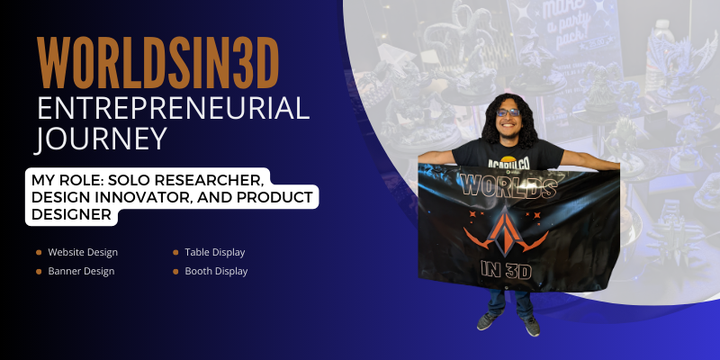
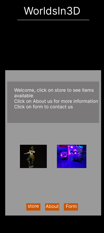
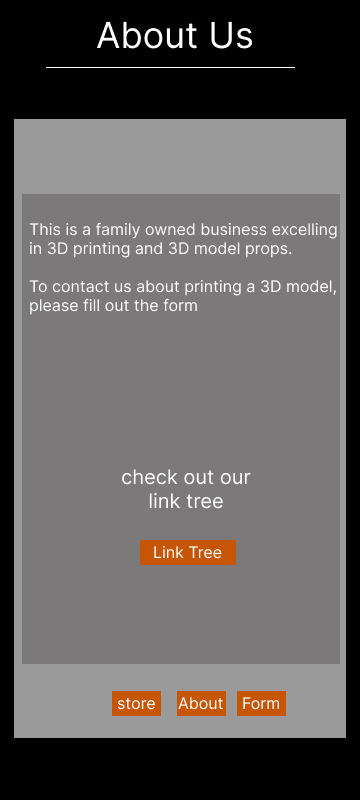
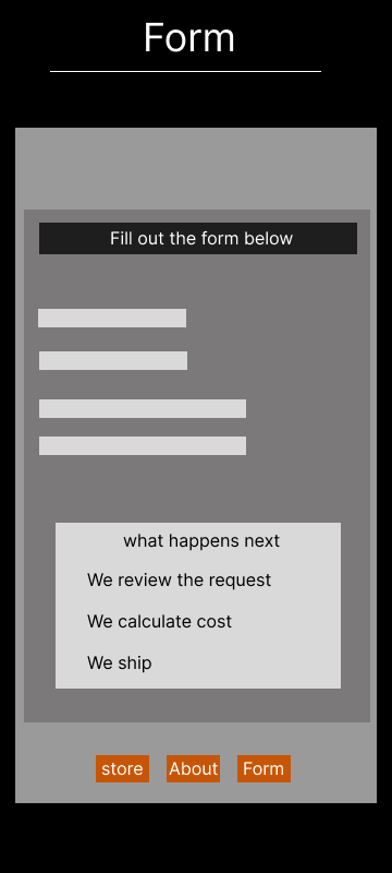
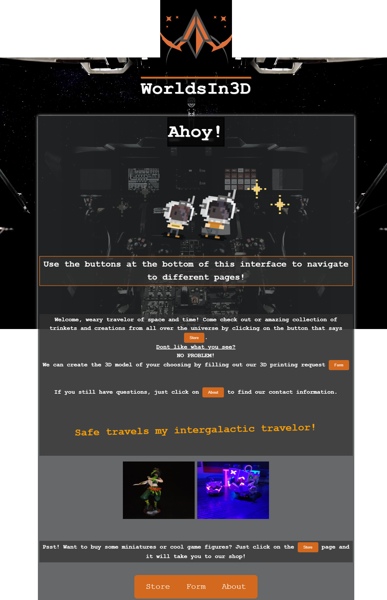
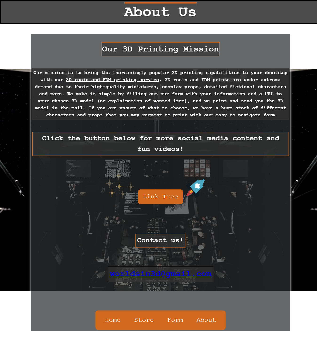
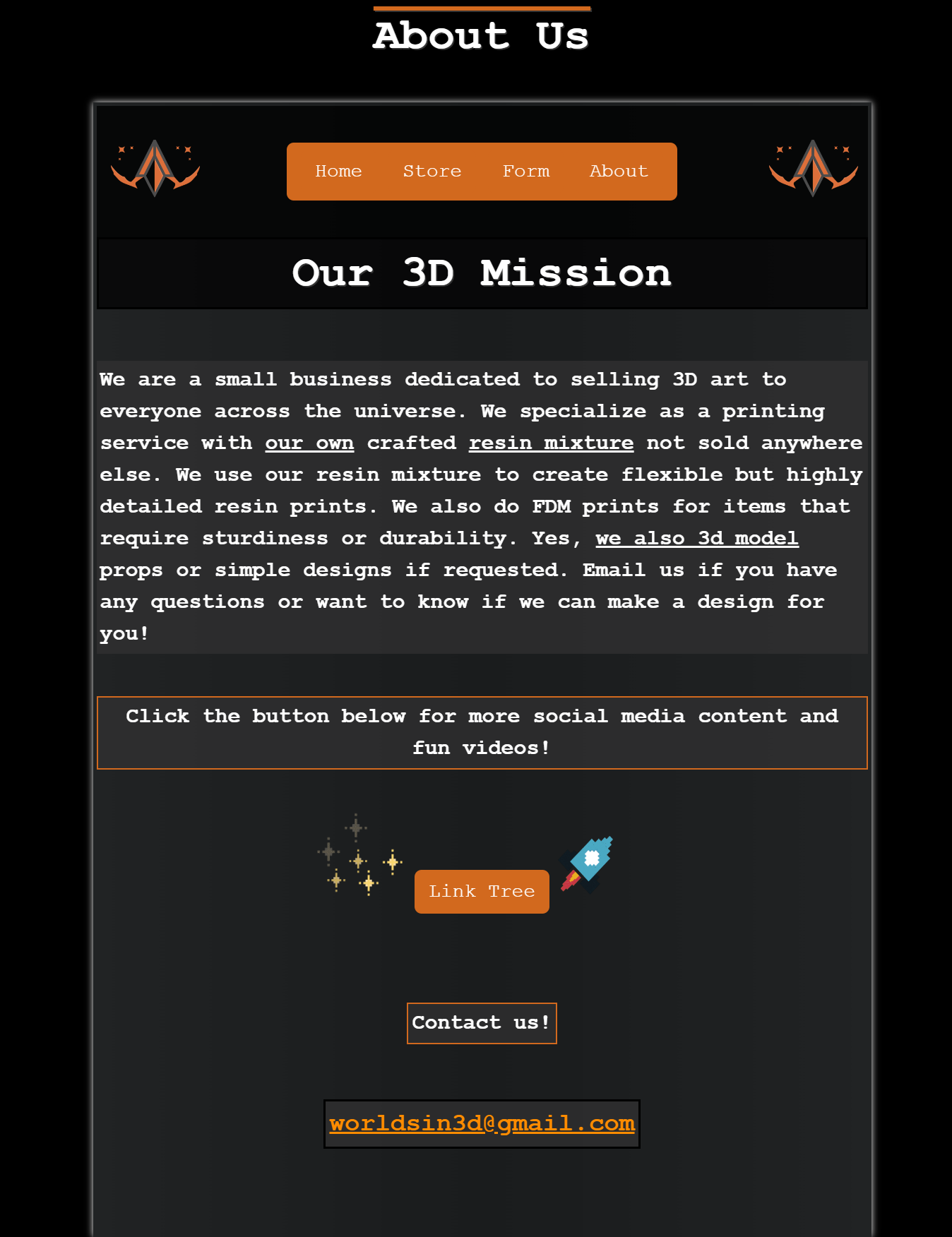
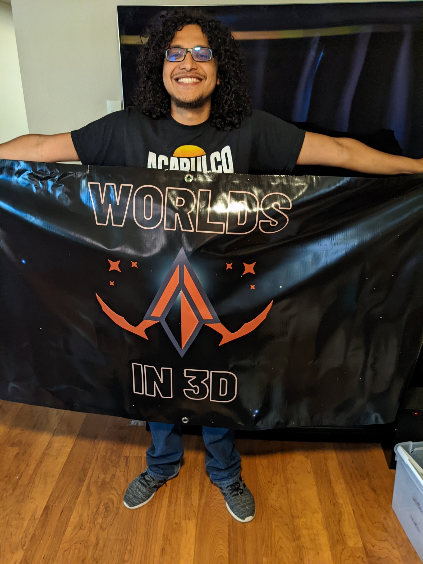
My client was the founder of Worldsin3D, a 3D printing business that also modeled some prop work. We discussed creating a website that could show his 3D printing business and also sell some of the miniatures that he prints for other artists. The owner wanted a website that fit the theme of his shop, which boasted a sci-fi feel mixed with fantasy elements. His goal was to make a fun and interactive website that would catch a user's eye, and direct them to his more professional online store. All of the creation and coding of the website came from me and I worked diligently to bring his ideas to life.
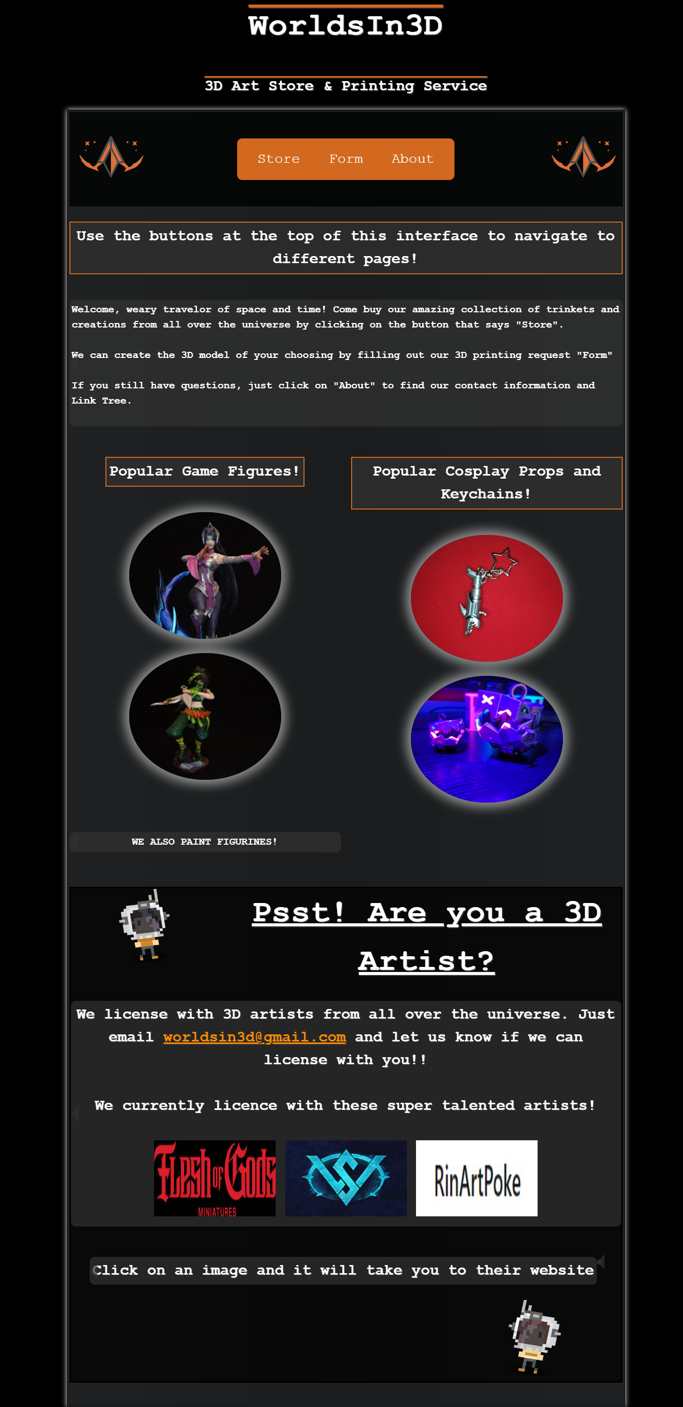
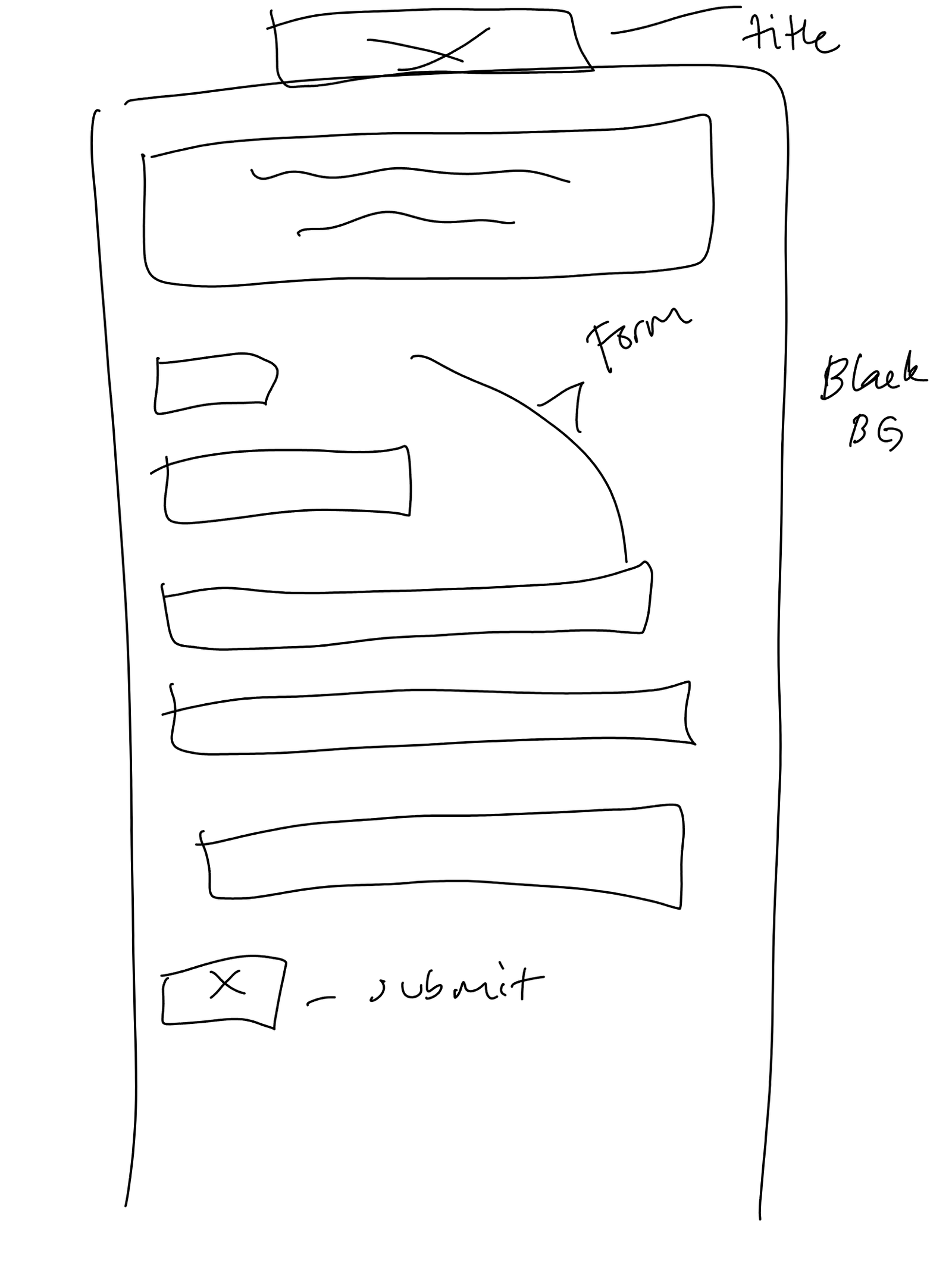
I started by laying down the framework for his website. Being that the business uses a sci-fi theme, and he wanted fun elements to it, I quickly drafted up a low fidelity wireframe with comments of different colors and elements that would be presented. The website wireframes were designed to briefly explain the business in the beginning, include parts that would encourage users to seek the owner out for printing, and also provide more detailed information about the business elsewhere. I decided to go with a simple black background, while incorporating his business colors of black, grey and orange. In my low fidelity wireframes I came up with a sketch of a gray interface to give information, which is something similarly seen on sci-fi films.
The biggest issues I faced while creating this website were that I was alone in its design and creation. I was quite familiar with team dynamics from my classes but this was the first time I was really creating something as my own. It was also my first time trying out figma and getting used to its settings, and so my mock up wasn't as detailed as it could have been. Since I was coding with HTML and CSS, I wasn't able to make a fully functional online store, and I chose to use Square to design an online store from scratch. With my beginning knowledge of coding, I worked with the code as best I could to match the mock ups. What was created was a very colorful and sporadic website with features and elements that were placed differently than most websites.
Clients Banner made by me
The first table display I created
Another image of the display I created

Being that I was very new to coding, and I didnt have a team to rely on to cover most design work bases, I decided to do a form of First Click testing and usability testing as I chose participants to click around my website. I chose two users that fit our target audience demographic of young individuals interested in 3D printing or having an artistic background. Both my users clicked around the website and noted that the placement of the navigation bar was odd and hard to find at first. They also mentioned the lack of images and text telling them what sort of items were available in the store. One user commented that they wanted to find the store button right away to see what items they could shop for. It gave me a look into what behaviors a user would display based on their wants, whether they were only interested in the online store, or if they were focused on the printing service. It was also noted that users who were familiar with table top games also wanted to see the products as soon as the could. The users also commented on the form used to gather information and wanted some guidance on why the form was there and generally requested more information about it.
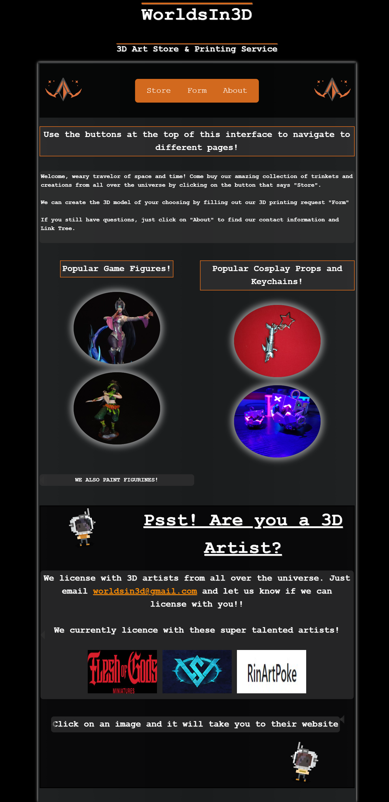
Second Iteration of Homepage
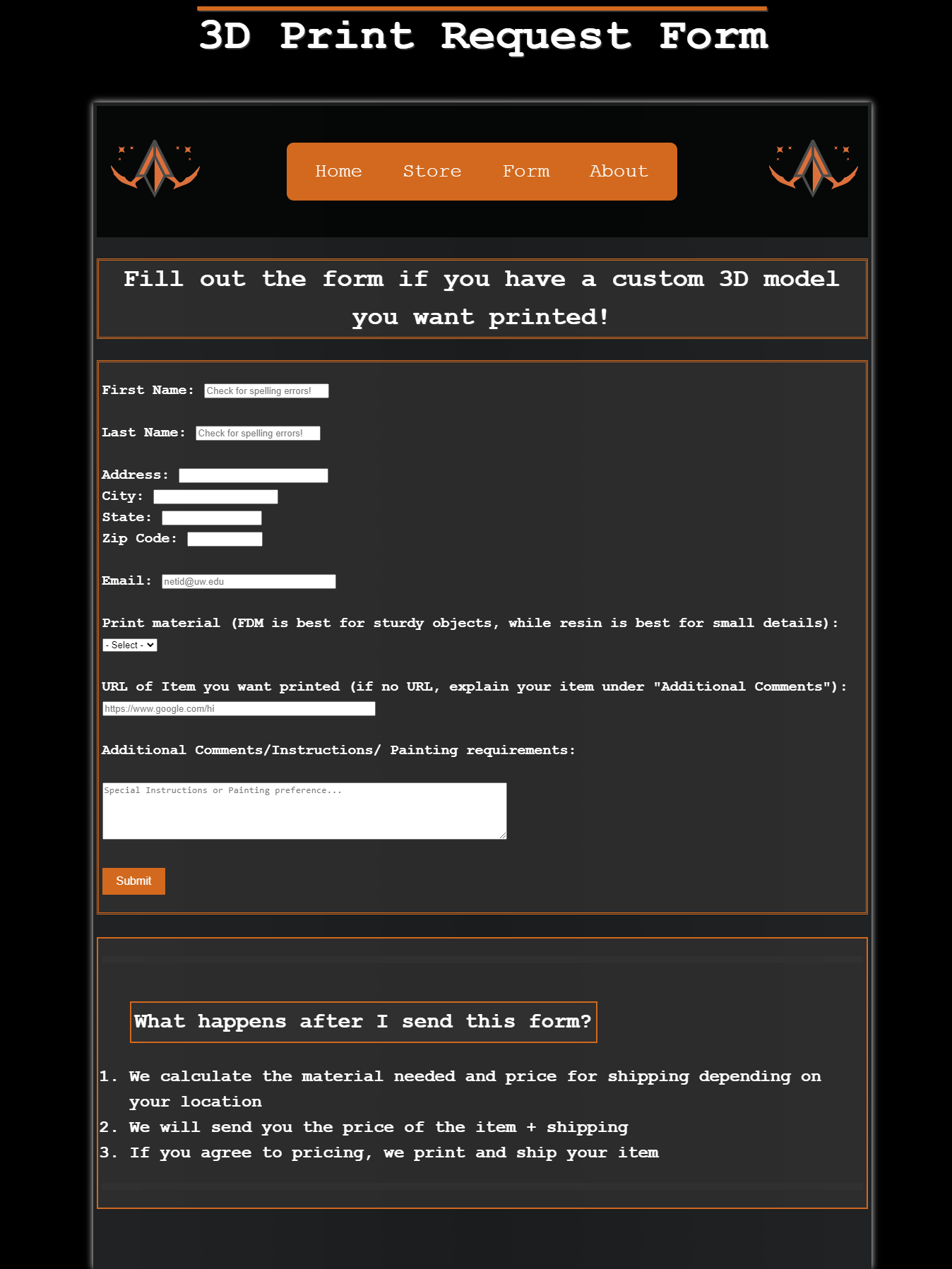
Second Iteration of Form page
Second iteration of online store
With the website created, and the client pleased with the work, I was presented with another opportunity to continue my entrepreneurship experience. My client requested me to help with the creation of their banner and two booth setups to help promote the selling of their work. Given this unique opportunity to put my physical design capabilities into practice I was more than eager to start. I used Canva to create a banner that would give the Sci-Fi feel, and also used the spaceship logo that was created before we had started this journey. After the banner was created, I then turned my focus onto creating the first setup, which was just a table needing to showcase the owners 3D prints. I knew I wanted to follow the Sci-Fi feel, but I also had to take into account the spacing of the table, and what items were going to be used to sell. After scoping out the table with the list of items I quickly set up a unique and interesting artist table.
Clients Banner made by me
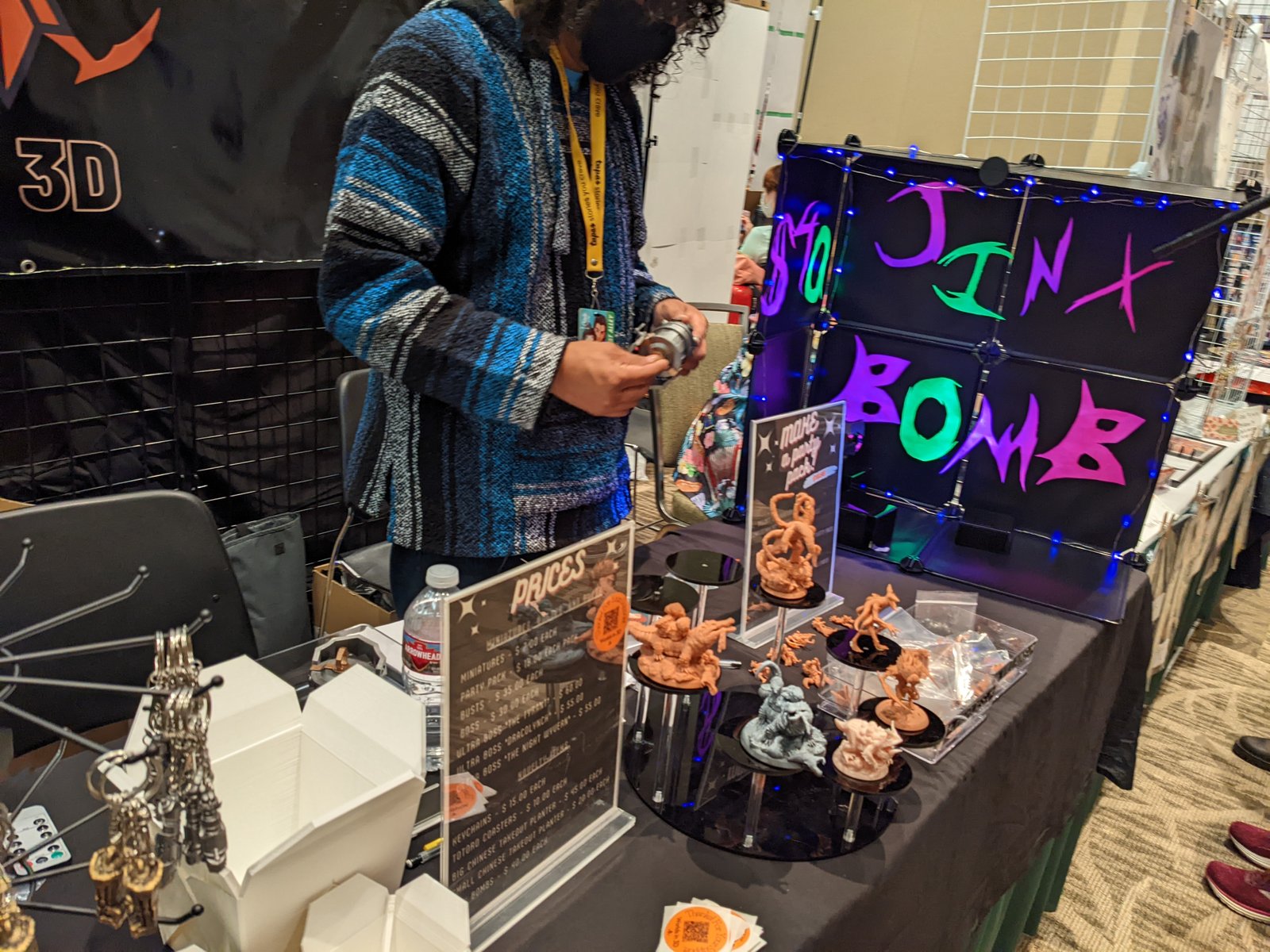
The first table display I created
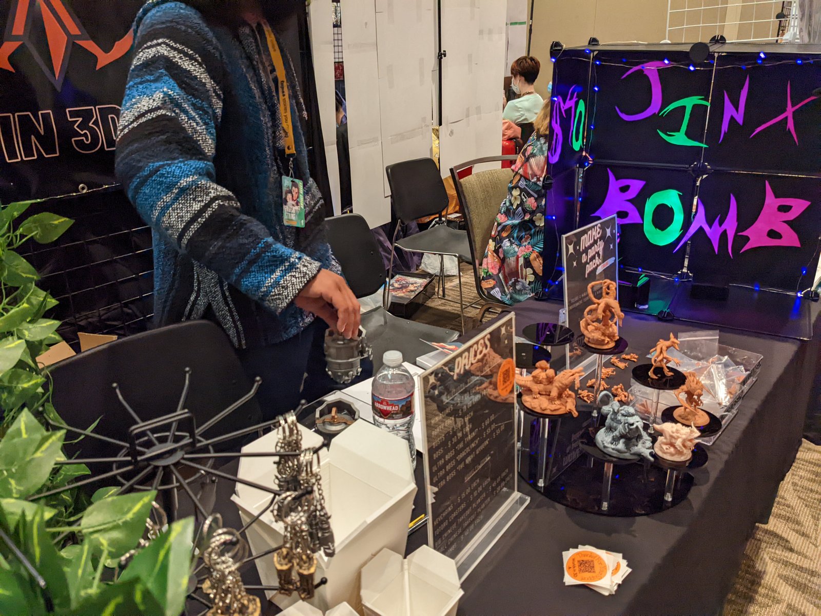
Another image of the display I created
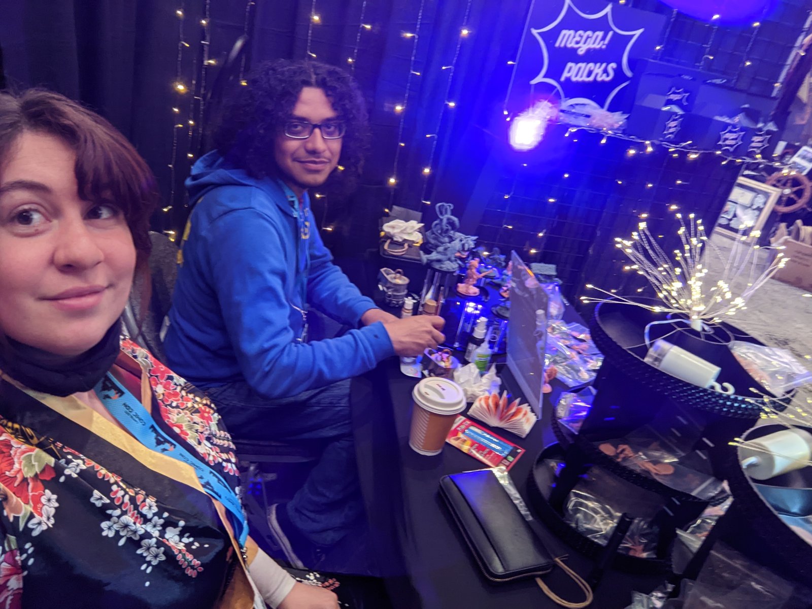
With a successful selling of items at this convention, the client returned asking me if I could then set up their booth for a large convention in Canada. This challenged me in many ways, as I needed to know the space in which I could work, and again, what items were needing to be sold. I drew a quick sketch of a setup that could work well given the measurements of the booth. With this completed, I just needed to then gather the display material needed for the booth’s visual display
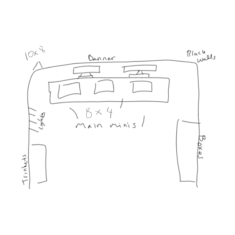
After the material was gathered, the booth sketch completed, and the list of items ready to be revealed, I was ready to start on the actual display. This display took about two days to finish setting up, but we came away with a beautiful setup ready to deliver to ready buyers. The booth was a large success and the owner was able to promote his business to many eager clients.
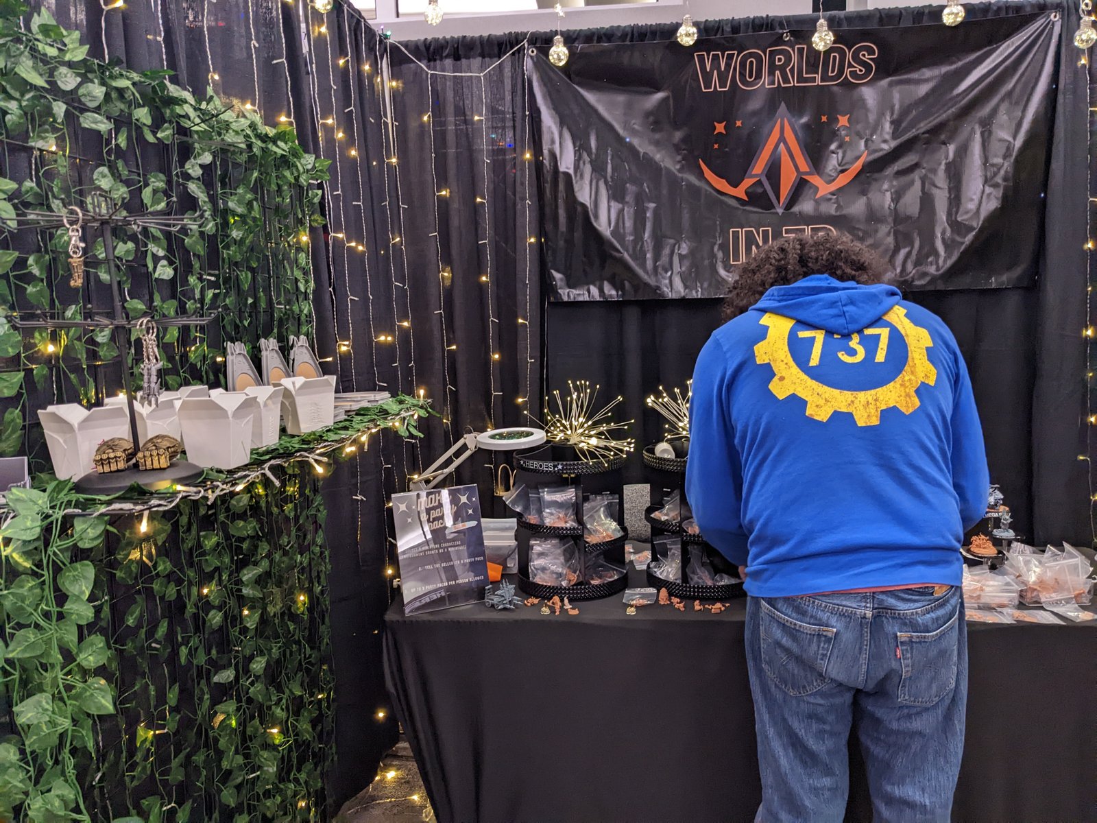
Image of one side of the booth display
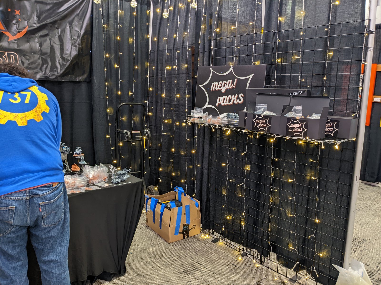
Another side of the booth display

Image of the table display
I learned so many interesting things through my journey of creating a website, to a banner, and then to creating two very unique and fun booth setups to display the clients work. I learned a lot while working with a client directly by creating my first website, hosting and maintaining it, and also creating physical designs that could be appreciated by many types of users. My role in this journey was to be a leader in both developing a website and a manager when it came to the physical displays. I was able to bring positivity and motivation into meeting my clients needs and also attracting the target audience to meet the clients goals in selling and promoting his business. I had learned a lot from this journey and it was one of my biggest successes.
/Homepage.png)
Home Page
/Resources.png)
Resources Page
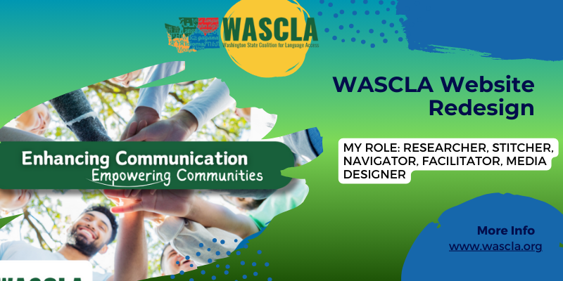
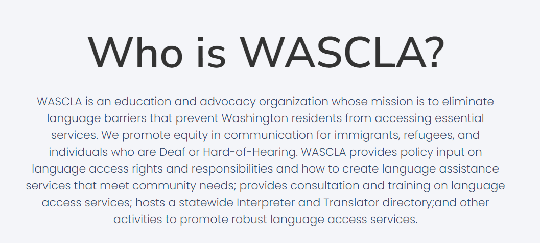
WASCLA, the Washington State Coalition for Language Access, is committed to removing language barriers for Washington residents, focusing on immigrants, refugees, and the Deaf or Hard-of-Hearing communities. Recently, their website has been almost completely shut down, prompting an urgent redesign to bring the website to life and improve user experience. This redesign is important to maintaining their goal of providing resources and information to limited english speakers.
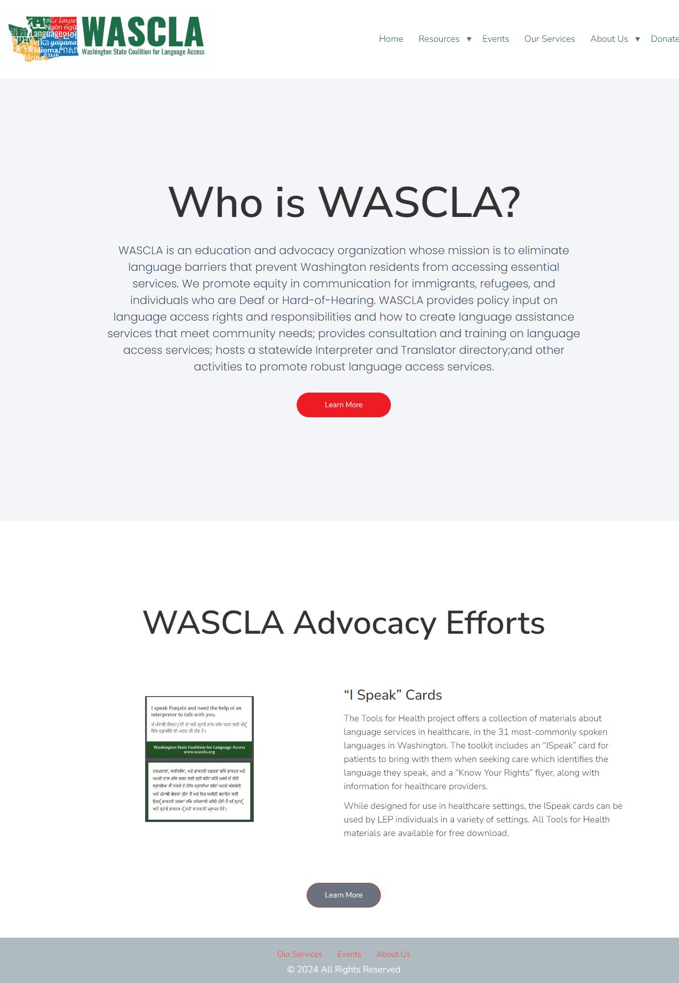
The current WASCLA homepage
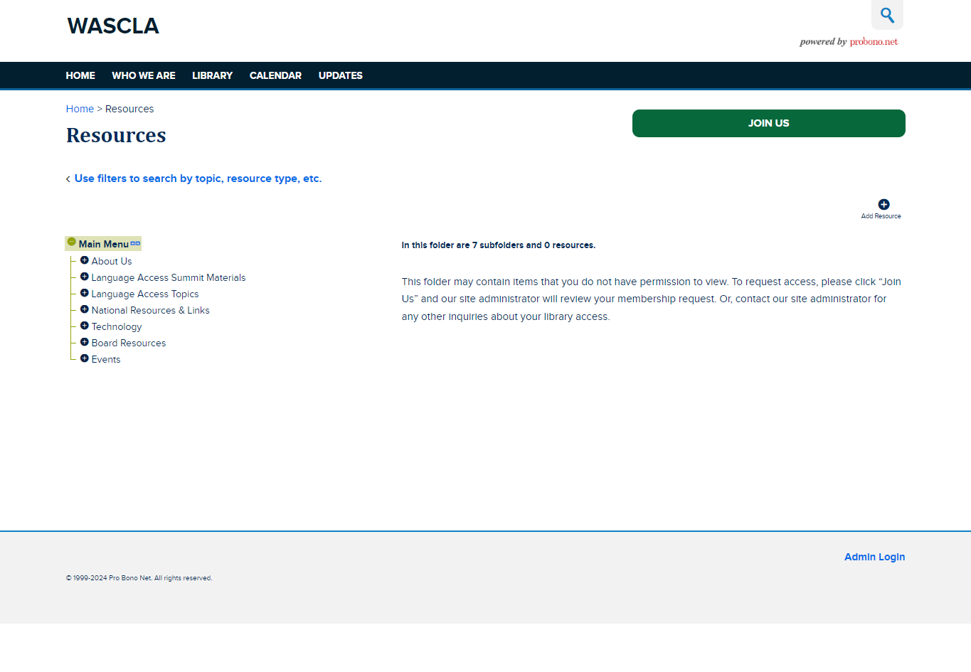
The current WASCLA resources library
I met my client through my design studio class. They were the founders of WASCLA (Washington State Coalition for Language Access) and were looking to develop a new website. They wanted to see some prototypes that would help their developer create an effective and engaging site. We decided to focus on creating a user-friendly website that organizations could easily navigate to find the resources and information they need. This project was a great opportunity to apply what I've learned in class to a real-world scenario.
www.wascla.org
The primary problem we wanted to tackle was creating a user-friendly website with easy navigation for organizations. Many organizations that need information about language access are often busy and don't have a lot of time to spend searching for resources. Our goal was to ensure that everything was streamlined for users, making it quick and straightforward for them to find the information they need. By improving the website’s usability, we aimed to support these organizations in accessing vital language access resources efficiently.
We conducted various user research methods: two of us conducted surveys, and two of us conducted card sorting. My card sorting results showed that users quickly and frequently sorted cards for contact information, technical help, and event calendars, indicating they found these cards important and easy to understand. In contrast, cards for the mailing list and website-specific news were often sorted later and less consistently, suggesting that users viewed these as less important or were unsure about where to place them. These patterns highlight the need to make essential information like contact details and technical help prominent and easily accessible on the website, while clarifying and improving the visibility of less prioritized sections like the mailing list and website updates.
With the user research we conducted, we presented the class with the first iterations of the homepage and resources page. The user feedback we gathered included:
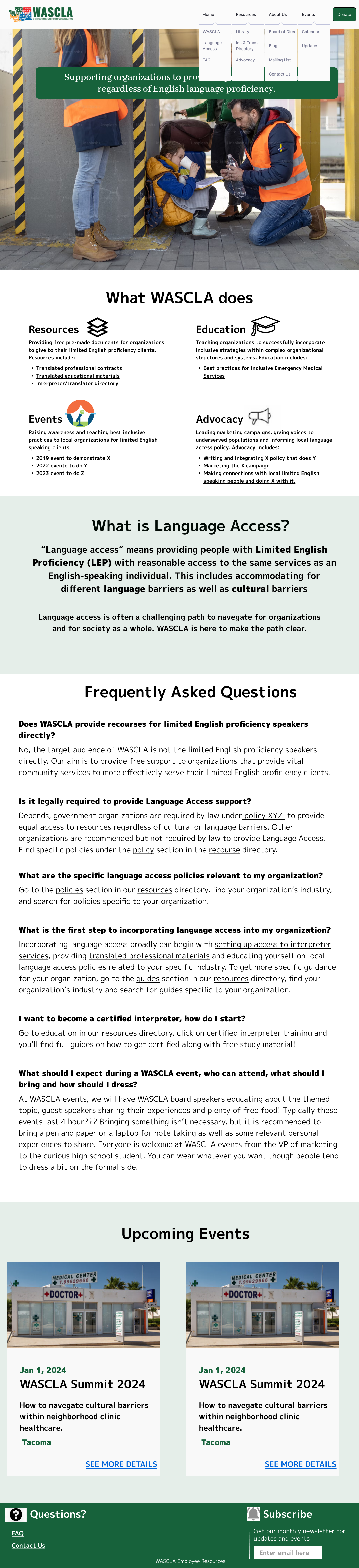
We implemented those changes in our prototype to create new iterations of the homepage and resources page
/Homepage.png)
2nd iteration of Homepage
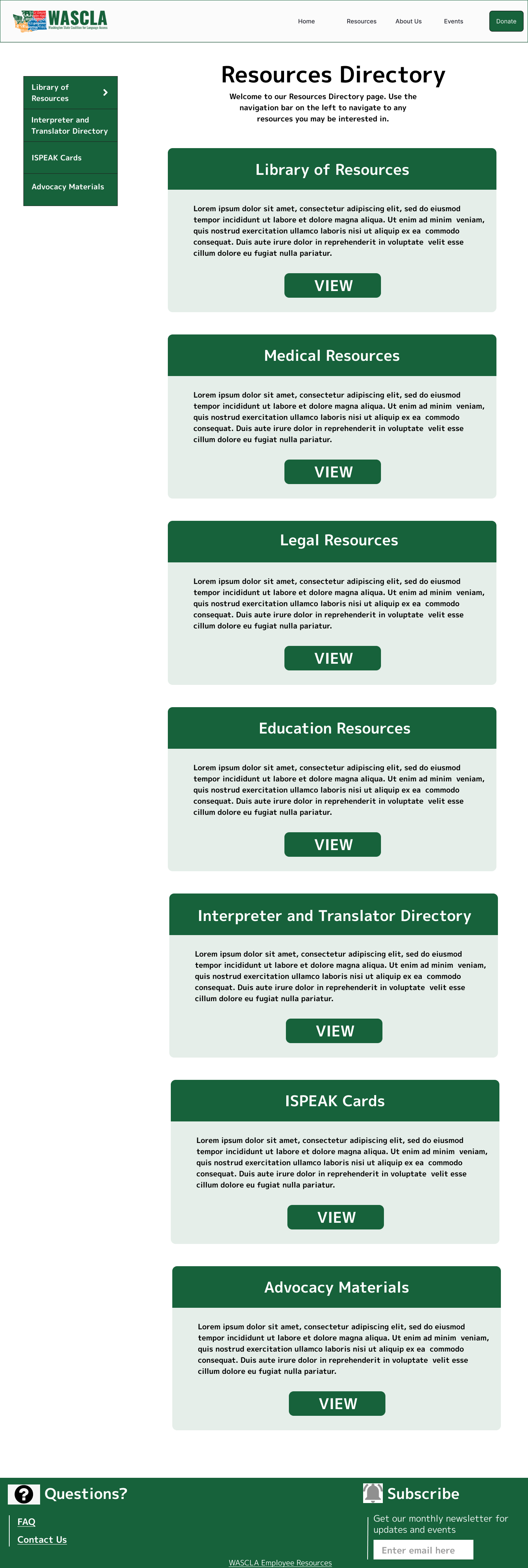
/Resources.png)
2nd iteration of Resources page
We conducted usability testing to evaluate the WASCLA website design and navigation, using both moderated and unmoderated sessions. The results showed that:
3rd iteration of Homepage
3rd iteration of Resources page